Responsive Web Design
In today’s mobile-first digital world, small businesses cannot afford to overlook the importance of responsive web design. A website that adapts seamlessly to all devices—desktops, tablets, and smartphones—not only improves user experience but also drives higher engagement, boosts conversions, and strengthens SEO rankings. For small businesses looking to grow, adopting responsive design is no longer optional; it’s a necessity.
What is Responsive Web Design?
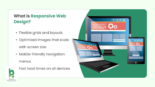
Responsive web design is a design approach where a website automatically adjusts its layout, images, and functionality to fit different screen sizes. Instead of creating separate websites for mobile and desktop, businesses can maintain one site that works flawlessly everywhere.
Key features include:
- Flexible grids and layouts
- Optimized images that scale with screen size
- Mobile-friendly navigation menus
- Fast load times on all devices
This ensures your audience enjoys a consistent browsing experience, whether they’re on a phone, tablet, or computer.
Responsive Web Design Examples
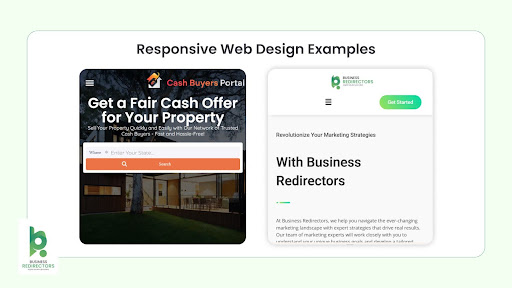
Many well-known companies use responsive design to deliver excellent user experiences. For example:
- Business Redirectors: Their website delivers a clean, mobile-friendly experience with simple navigation that adapts to every screen.
- Cash Buyers Portal: Designed to automatically adjust images, fonts, and CTAs for different devices, ensuring smooth browsing across desktop, tablet, and mobile.
For small businesses, these responsive web design examples highlight how a user-friendly site can enhance trust and encourage customers to stay longer.
Responsive Website Templates for Small Businesses
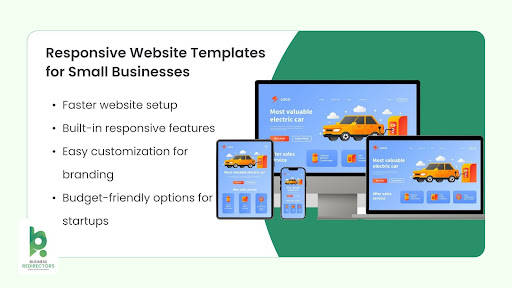
If you don’t have the budget for a custom design, responsive website templates are a cost-effective solution. Platforms like WordPress, Wix, and Shopify offer thousands of pre-made templates designed for mobile responsiveness.
Benefits of using templates include:
- Faster website setup
- Built-in responsive features
- Easy customization for branding
- Budget-friendly options for startups
By choosing the right template, small businesses can have a professional, mobile-friendly website without heavy investment.
Why Responsive Web Design Matters
- Improved User Experience & Accessibility
- A responsive site prevents the need for pinching or zooming, ensuring seamless navigation.
- Wider reach since users can easily access your site across devices.
- Boosted Conversions & Sales
- Smooth user experience encourages longer visits and higher engagement.
- Mobile-friendly CTAs drive more clicks and conversions.
- Enhanced SEO & Visibility
- Google prioritizes mobile-friendly sites in rankings.
- Lower bounce rates because users stay engaged longer.
- Cost-Effectiveness & Efficiency
- Manage a single website instead of multiple versions.
- Unified analytics for better insights into customer behavior.
- Future-Proofing & Competitive Edge
- Adapts to new screen sizes and devices.
- Gives you an advantage over competitors without mobile-ready websites.
FAQs about Responsive Web Design
Q1. Why does responsive web design matter?
It matters because it ensures your website is user-friendly across all devices, improves SEO rankings, and increases conversions by keeping visitors engaged.
Q2. Why might retailers decide to use a responsive website design?
Retailers benefit from responsive websites because customers can shop easily on mobile, leading to higher sales and a better overall shopping experience.
Q3. What happens if a website is not responsive?
A non-responsive website looks distorted on mobile devices, loads slowly, and frustrates users. This leads to high bounce rates and lost sales opportunities.
Q4. When would you not use responsive web design?
In rare cases, if a business has a very device-specific app or requires a custom mobile-only platform, they may not use responsive design. However, for 99% of small businesses, responsive design is the best choice.
Q5. How to design a responsive website for your business?
To design a responsive website, use fluid grids, flexible images, and mobile-friendly navigation. Small businesses can start with responsive website templates or hire a web developer to build a custom solution.
Conclusion
For small businesses, responsive web design is more than just a design trend—it’s a growth strategy. By improving user experience, boosting SEO, and reducing costs, a responsive site ensures long-term success in a competitive digital landscape. Whether you use responsive website templates or invest in custom design, making your site mobile-friendly will position your business for future growth.
👉 If you want to learn how to design a responsive website for your small business, Business Redirectors can help with responsive templates and professional web design services to build a mobile-ready site that attracts and converts customers.